 skip to main content
Jetpack Compose series:
Jetpack Compose comes with the Material theme by default. It does a great job of styling apps that already follow Material guidelines. Moreover, Google published a comprehensive guide on how to customize it.
But.
As it’s often the case, most apps only partially follow Material guidelines and have their own custom design systems. In this situation, MaterialTheme cannot be used as it provides only Material styling.
In this article we will learn how to create a truly custom theme that follows our own design system.
How to create a custom theme
We will implement a custom theme in a similar manner as MaterialTheme. It will have a different set of attributes and their properties.
But first, let’s answer a few important questions before diving into the code:
- Can I use XML styles in Jetpack Compose?
- How does MaterialTheme work?
XML styles in Jetpack Compose
Unfortunately, XML styles are mostly not compatible with Jetpack Compose.
It’s impossible to reuse existing text styles or themes in JC layouts besides retrieving basic resources such as colors, dimensions, etc. However, I would also highly recommend recreating these in Jetpack Compose, which is covered in this article as well.
How Material Theme works
If you take a look at the MaterialTheme implementation you will notice that it consists of 2 main parts:
- The MaterialTheme object that contains attribute holders(
colors,typography,shapes)
object MaterialTheme {

    val colors: Colors
        @Composable
        @ReadOnlyComposable
        get() = LocalColors.current

    val typography: Typography
        @Composable
        @ReadOnlyComposable
        get() = LocalTypography.current

    val shapes: Shapes
        @Composable
        @ReadOnlyComposable
        get() = LocalShapes.current
}- The Composable that wraps UI and passes styling attributes down to inner composables
@Composable
fun MaterialTheme(
    colors: Colors = MaterialTheme.colors,
    typography: Typography = MaterialTheme.typography,
    shapes: Shapes = MaterialTheme.shapes,
    content: @Composable () -> Unit
)
In the following sections, we will create our own theme in a very similar way, but it will contain:
- colors
- typography
- dimensions
Create AppTheme
First, create the AppTheme object class that will contain color, typography and dimension attributes holders. Each of these components are going to be implemented in the following sections.
object AppTheme {

    val colors: AppColors
        @Composable
        @ReadOnlyComposable
        get() = LocalColors.current

    val typography: AppTypography
        @Composable
        @ReadOnlyComposable
        get() = LocalTypography.current

    val dimensions: AppDimensions
        @Composable
        @ReadOnlyComposable
        get() = LocalDimensions.current
}
All theme attributes are accessed with the AppTheme object.
Add app colors
For the sake of simplicity, our demo app will have only 5 colors:
- primary
- textPrimary
- textSecondary
- background
- error
We will also add an isLight property to define if the colors set is for a light or dark mode.
AppColors will be the most complicated component among the three as it can change its values in runtime(also to support both light and dark modes).
Create the AppColors class. It should contain:
- specified color tokens
- getters and setters
- a
copyfunction
data class cannot be used here because of
mutableStateOfwhich is added to support dynamical color change.
class AppColors(
    primary: Color,
    secondary: Color,
    textPrimary: Color,
    error: Color,
    isLight: Boolean
) {
    var primary by mutableStateOf(primary)
        private set
    var secondary by mutableStateOf(secondary)
        private set
    var textPrimary by mutableStateOf(textPrimary)
        private set
    var error by mutableStateOf(error)
        private set
    var isLight by mutableStateOf(isLight)
        internal set

    fun copy(
        primary: Color = this.primary,
        secondary: Color = this.secondary,
        textPrimary: Color = this.textPrimary,
        error: Color = this.error,
        isLight: Boolean = this.isLight
    ): AppColors = AppColors(
        primary,
        secondary,
        textPrimary,
        error,
        isLight
    )

    // will be explained later
    fun updateColorsFrom(other: AppColors) {
        primary = other.primary
        textPrimary = other.textPrimary
        textSecondary = other.textSecondary
        background = other.background
        error = other.error
    }
}
What’s mutableStateOf?
mutableStateOf creates a MutableState object that holds the color value. The value is wrapped into MutableState for Jetpack Compose to observe the writes to this property and then update the UI that uses it.
Setting your colors
Create your colors below the AppColors class as variables:
private val colorLightPrimary = Color(0xFFFFB400)
private val colorLightTextPrimary = Color(0xFF000000)
private val colorLightTextSecondary = Color(0xFF6C727A)
private val colorLightBackground = Color(0xFFFFFFFF)
private val colorLightError = Color(0xFFD62222)
0xFFFFB400is just an ARGB color int. Having a color hex(for example, #FFB400) you can turn it into ARGB color int by adding0xFFin the beggining. To set transparancy to the color, update theFFvalue after0x
Add a lightColors() function to create a light theme color scheme for the app:
fun lightColors(
    primary: Color = colorLightPrimary,
    textPrimary: Color = colorLightTextPrimary,
    textSecondary: Color = colorLightTextSecondary,
    background: Color = colorLightBackground,
    error: Color = colorLightError
): AppColors = AppColors(
    primary = primary,
    textPrimary = textPrimary,
    textSecondary = textSecondary,
    background = background,
    error = error,
    isLight = true
)
To support a dark theme just add dark mode colors and create a darkColors() function in the same way as the lightColors():
fun darkColors(
    primary: Color = colorDarkPrimary,
    textPrimary: Color = colorDarkTextPrimary,
    textSecondary: Color = colorDarkTextSecondary,
    background: Color = colorDarkBackground,
    error: Color = colorDarkError
): AppColors = AppColors(
    primary = primary,
    textPrimary = textPrimary,
    textSecondary = textSecondary,
    background = background,
    error = error,
    isLight = false
)Accessing the colors
The last step is to create the LocalColors object. It’s an instance of CompositionLocal which does 2 things:
- implicitly passes color attributes through the composition tree of our UI
- updates the UI once some value changes
Create it with staticCompositionLocalOf as it will trigger the whole content lambda to be recomposed once some value is changed.
internal val LocalColors = staticCompositionLocalOf { lightColors() }Add text styles
Text styles(typography) are added in a very similar way.
Specify the type scales(text types) of your design system. In this demo we will have the following type scales:
- h1
- subtitle
- body
- button
- caption
Create AppTypography
Add a data class named AppTypography whose properties are the type scales (h1, subtitle, body, etc.). Assign the default values right in the constructor, setting an appropriate TextStyle for each element.
We will also add some custom fonts to the app. I’ll create them right above the typography class:
private val rubik = FontFamily(
    Font(R.font.rubik_regular, FontWeight.Normal)
)

private val openSans = FontFamily(
    Font(R.font.open_sans_regular, FontWeight.Normal)
)

data class AppTypography(
    val h1: TextStyle = TextStyle(
        fontFamily = rubik,
        fontWeight = FontWeight.Normal,
        fontSize = 24.sp
    ),
    val subtitle: TextStyle = TextStyle(
        fontFamily = openSans,
        fontWeight = FontWeight.Normal,
        fontSize = 16.sp
    ),
    val body: TextStyle = TextStyle(
        fontFamily = openSans,
        fontWeight = FontWeight.Normal,
        fontSize = 16.sp
    ),
    val button: TextStyle = TextStyle(
        fontFamily = rubik,
        fontWeight = FontWeight.Normal,
        fontSize = 16.sp
    ),
    val caption: TextStyle = TextStyle(
        fontFamily = openSans,
        fontWeight = FontWeight.Normal,
        fontSize = 12.sp
    )
)

internal val LocalTypography = staticCompositionLocalOf { AppTypography() }
Don’t forget about LocalTypography to store and provide the typography.
Add dimensions
Dimensions are added in a similar manner as typography. Set default values to the constructor and add the LocalDimensions holder to access the dimensions.
data class AppDimensions(
    val paddingSmall: Dp = 4.dp,
    val paddingMedium: Dp = 8.dp,
    val paddingLarge: Dp = 24.dp
)

internal val LocalDimensions = staticCompositionLocalOf { AppDimensions() }Make AppTheme Composable
We just created AppColors, AppTypography and AppDimensions for our styling attributes.
Now it’s time for the final touch.
Add the AppTheme composable that will wrap our UI content(just as MaterialTheme does) and pass the current styling to the composables inside.
To do so, make a Composable function named AppTheme with 4 parameters:
- colors
- typography
- dimensions
- content lambda
The first 3 arguments should use default values from AppTheme object.
@Composable
fun AppTheme(
    colors: AppColors = AppTheme.colors,
    typography: AppTypography = AppTheme.typography,
    dimensions: AppDimensions = AppTheme.dimensions,
    content: @Composable () -> Unit
) {
...
}
To pass the actual values from your styling attributes, you should wrap content lambda with a CompositionLocalProvider. It will tell LocalColors, LocalDimensions and LocalTypography to provide the styling attributes you pass to the theme function to the inner composables.
@Composable
fun AppTheme(
    colors: AppColors = AppTheme.colors,
    typography: AppTypography = AppTheme.typography,
    dimensions: AppDimensions = AppTheme.dimensions,
    content: @Composable () -> Unit
) {
    // creating a new object for colors to not mutate the initial colors set when updating the values
    val rememberedColors = remember { colors.copy() }.apply { updateColorsFrom(colors) }
    CompositionLocalProvider(
        LocalColors provides rememberedColors,
        LocalDimensions provides dimensions,
        LocalTypography provides typography
    ) {
        content()
    }
}
And that’s it. Now when we created a custom theme in Jetpack Compose, let’s make a screen with it and style the UI inside.
Styling UI elements
In this section, I’ll focus singly on the UI part, but you can have a look at the entire project in the GitHub repo.
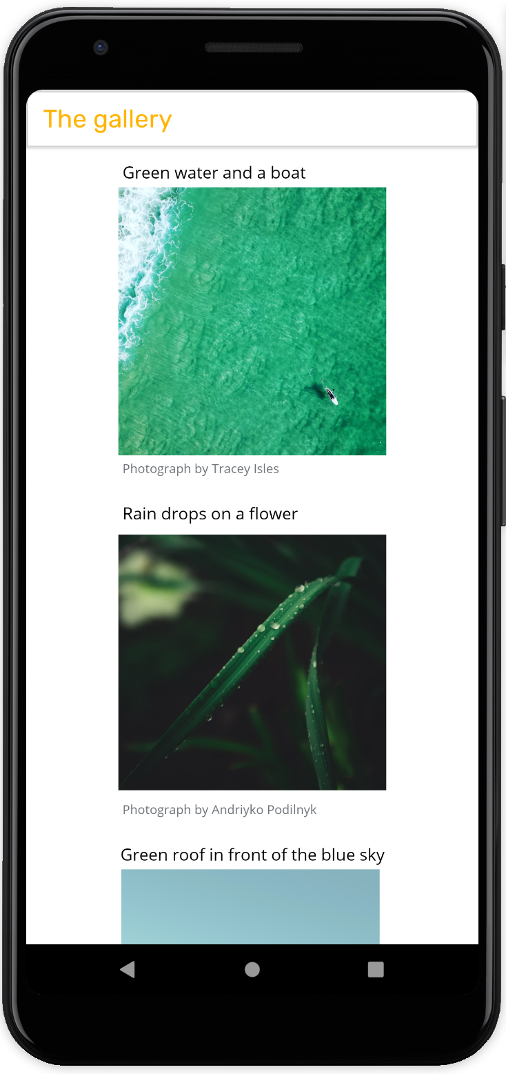
For a demo, we will create a very basic app that will show us a list of photographs, their descriptions and authors.
First, create a screen and wrap it into the AppTheme:
    setContent {
        AppTheme {
            DemoScreen(items = photographItems)
        }
    }
DemoScreen is basically a Composable that holds all UI elements(other composables) of the screen. We will make a simple scrollable list(LazyColumn) with a toolbar.
@Composable
fun DemoScreen(items: List<PhotographItem>) {
    LazyColumn(
        horizontalAlignment = Alignment.CenterHorizontally,
        modifier = Modifier
            .fillMaxSize()
            .background(AppTheme.colors.background)
    ) {
        item {
            TopAppBar(
                title = {
                    Text(text = "The gallery")
                },
                backgroundColor = Color.Transparent,
                elevation = 2.dp
            )
        }
        items(items) { item ->
            GalleryItem(item)
        }
    }
}
Now let’s add some styling. First, set the background of the LazyColumn to the background color of our theme. Then style the toolbar title by assiging h1 scale type and primary color to its properties:
LazyColumn(
        horizontalAlignment = Alignment.CenterHorizontally,
        modifier = Modifier
            .fillMaxSize()
            .background(AppTheme.colors.background)
    ) {
        item {
            TopAppBar(
                title = {
                    Text(
                        text = "The gallery",
                        style = AppTheme.typography.h1,
                        color = AppTheme.colors.primary
                    )
                }
                ...
    }
As you can see, styling attributes can be easily accessed with AppTheme object. It always holds the actual values as they are provided from a CompositionLocal.
Now let’s have a look at the GalleryItem. We want our list items to look as simple as this:
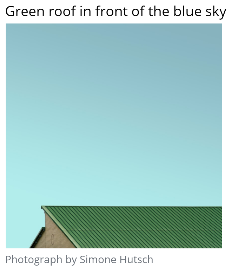
So the GalleryItem composable will have:
- description text of the content
- the photograph itself
- a caption with the name of the author
To achieve this, we create a Column and put Text, Image and Text composables inside for the description, photograph and caption accordingly. Then apply the typography and colors from AppTheme and you will get:
@Composable
fun GalleryItem(item: PhotographItem) {
    Column(
        modifier = Modifier.padding(AppTheme.dimensions.paddingMedium)
    ) {
        Text(
            text = item.description,
            style = AppTheme.typography.body,
            color = AppTheme.colors.textPrimary
            modifier = Modifier.padding(AppTheme.dimensions.paddingSmall)
        )
        Image(
            rememberImagePainter(item.photoUrl),
            contentDescription = null,
            modifier = Modifier.size(256.dp)
        )
        Text(
            text = item.author,
            style = AppTheme.typography.caption,
            color = AppTheme.colors.textSecondary,
            modifier = Modifier.padding(AppTheme.dimensions.paddingSmall)
        )
    }
}
Build the app to make sure that the screen is using the styling we applied:
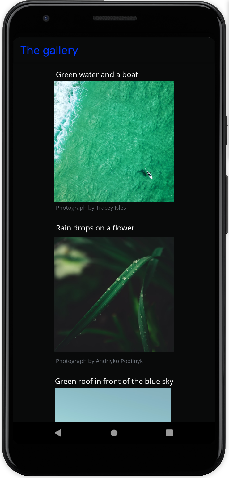
Applying dark mode
To apply the dark theme just pass darkColors() to your theme:
    AppTheme(colors = darkColors()) {
        DemoScreen(items = photographItems)
    }
You can also check if the system theme is dark and then retrive a proper set of colors:
    val darkTheme: Boolean = isSystemInDarkTheme()
    val colors = if (darkTheme) darkColors() else lightColors()
As the result, all composables inside your theme will have updated styling attributes:
Further reads
Full code in the GitHub repo
Theming in Compose
Material Theme source code
Jetpack Compose theming codelab